You already have a website that works. Customers use it, the flows are familiar, and your team probably has a backlog full of requests that all sound similar: “Can we get this into the App Store?” “Can we send push notifications?” “Why does this feel like a website on a phone?”
That's the point where many teams make an expensive mistake. They treat mobile as a rebuild problem when it's usually an evolution problem. If you want to make a mobile app from a website, the smartest move usually isn't jumping straight to a full iOS and Android rewrite. It's figuring out the smallest step that improves the user experience now, then escalating only when the product needs it.
That matters because the commercial pull is real. The global mobile app market is valued between $750 billion and $800 billion in 2025 and is projected to reach $1.1 trillion by 2034, while mobile apps were expected to generate over $935 billion in revenue in 2023 according to mobile app market projections compiled here. If your business depends on repeat usage, transactions, or logged-in customer workflows, mobile can't stay an afterthought for long.
The good news is you've got options. A basic wrapper, a PWA, a hybrid app, or a native port all solve different problems. Some are fast. Some are polished. Some are easy to maintain. Some are painful if chosen too early. If your team is evaluating where app work fits within broader product and ops priorities, it helps to view the decision in the context of broader software use cases across teams.
Table of Contents

- Why Turn Your Website Into an App Now
- The Four Main Paths From Web to App
- Choosing Your Path A Strategic Decision Framework
- Adapting Code and UX for a True App Experience
- Navigating App Store Packaging and Submission
- Safe Rollouts and Managing Future App Updates
Why Turn Your Website Into an App Now
A common situation looks like this. The website already brings in traffic and handles the core transaction, but mobile users still drop off during repeat tasks. Signing in takes too long. Checkout feels cramped. Returning customers hunt through browser tabs instead of tapping an icon and getting on with it.
That is usually the point where the conversation shifts from “Do we need an app?” to “What problem are we trying to remove first?” That distinction matters. A rushed rebuild can burn budget without improving retention, while a phased mobile plan can improve the experience in steps and keep risk under control.
For product and engineering teams, the strongest case for turning a website into an app is rarely prestige. It is habit. If users come back often to book, buy, track orders, message support, manage accounts, or complete recurring tasks, reducing friction has direct value. Faster access, saved sessions, push notifications, and better mobile performance can all help, but only if they support behavior people already want to repeat.
The primary opportunity lies in repeated usage
Websites still do many jobs well. They capture search traffic, support content discovery, and make it easy to share links with new users. An app starts to earn its keep when the relationship is ongoing.
That usually means one of a few patterns. Customers reorder regularly. Staff check dashboards throughout the day. Members return to the same tools every week. Patients, drivers, learners, or subscribers expect quick access, not a fresh browser session each time. If that sounds like your product, app planning becomes a retention and conversion decision, not just a branding exercise.
I usually advise teams to map frequency before they map features. If mobile usage is occasional, improve the site first. If mobile usage is frequent and time-sensitive, app-like access can justify the added build and maintenance cost.
Treat it as an evolution, not a rebuild
Teams often waste time. They compare a PWA, a wrapper, a hybrid app, and a native build as if all four are equally sensible on day one. They are not.
A better approach is phased:
- Improve weak mobile web flows first.
- Add PWA features when installability, speed, or offline support would help.
- Package for app stores when distribution, trust, or notifications start to matter more.
- Invest in deeper native work only when device features or performance demands justify it.
That sequence keeps the scope honest. It also gives the business a way to learn before committing to the most expensive option.
For teams weighing those next steps, these web-to-app use cases help clarify which path fits the product you already have, instead of forcing a rebuild too early.
The Four Main Paths From Web to App
When people say they want to make a mobile app from a website, they usually mean one of four very different approaches. The technical labels matter less than the trade-offs.
WebView wrapper
A WebView wrapper is the fastest concept to understand. It's basically your site running inside a dedicated browser window packaged as an app.
That can be useful when you need a lightweight container around existing web functionality. Internal tools, simple account portals, and time-sensitive launches sometimes start here. The appeal is obvious. You reuse most of what already exists.
The watch-out is just as obvious. If the website experience is mediocre on mobile, the wrapped app won't magically become good. It often feels like a browser trapped inside an app icon.
Progressive Web App
A Progressive Web App, or PWA, is your website learning app-like behaviors. It can be installable, work better offline, and feel more persistent than a standard mobile site.
This path is often the best first move when you want better mobile engagement without taking on full app store complexity. It keeps one codebase, supports rapid iteration, and lets you improve the product before committing to deeper packaging work.
A PWA is especially strong when your biggest problems are mobile performance, install friction, and revisit behavior rather than advanced device integration.
Hybrid app
A hybrid app sits between a wrapper and a full native build. You still share a lot of code, but you can add a stronger app shell, mobile-aware navigation, and selected access to native device features.
For many product teams, this becomes the practical middle ground. You get more control over the app feel and more room to integrate push, camera access, or platform-specific behavior, without running two entirely separate codebases from scratch.
Hybrid is a good option when the website has real product maturity, but the mobile app needs to feel more intentional than a packaged browser tab.
Native port
A native port means rebuilding key experiences specifically for iOS and Android using platform-native patterns and capabilities.
This is the most expensive and operationally demanding route, but it's the right answer when the product depends on things a web-centered approach handles poorly. Examples include heavy background processing, advanced camera workflows, AR, complex gesture-driven interfaces, or highly platform-specific behaviors.
The mistake isn't choosing native. The mistake is choosing native before you've proved you need native.
Comparison of Website-to-App Approaches
| Approach | Cost & Time | Performance | Native Feature Access | Best For |
|---|---|---|---|---|
| WebView wrapper | Lowest initial effort, fastest packaging | Usually weakest if the site wasn't designed for app use | Limited | Internal tools, temporary packaging, simple portals |
| Progressive Web App | Moderate effort, efficient to maintain | Strong when the mobile web foundation is good | Some access, but not full platform depth | Repeat-use products that need installability without store overhead |
| Hybrid app | Higher effort than PWA, still more efficient than full native | Better than a basic wrapper when the shell and UX are adapted properly | Broader access to device features | Teams that need app-store presence and selective native behavior |
| Native port | Highest effort and maintenance load | Best when implemented well | Full platform access | Products that depend on native interactions, deep hardware integration, or platform-specific polish |
Don't choose based on what sounds most advanced. Choose based on the first real limitation your users are hitting.
Choosing Your Path A Strategic Decision Framework
The best teams don't ask, “Which app type is best?” They ask, “What's the next justified step?”
That shift matters because each increase in app complexity raises three costs at once: build effort, maintenance burden, and approval risk. A phased approach avoids paying all three before the product earns it.
The most successful methodology follows a staged path: optimize the mobile website first, add PWA features next, introduce an app shell when device features are required, and only consider a full native build after retention is strong, according to this phased conversion guidance. If you're making this call with engineering leadership, broader CTO planning concerns live here.

Start with the smallest useful leap
A lot of websites don't need an app yet. They need a better mobile website.
If mobile pages are slow, forms are awkward, and navigation still assumes desktop behavior, adding an app shell won't fix the underlying problem. It only hides it behind an install button. Start by tightening the mobile experience itself. Responsive layouts, lighter assets, cleaner flows, and better page transitions often provide most of the near-term value.
After that, ask whether installability and offline behavior would meaningfully improve the product. If yes, a PWA is usually the cleanest next step. If no, keep investing in the web foundation.
Questions that force the right decision
Use these questions in product review. They expose whether you need a PWA, a packaged app, or a deeper rebuild.
-
Do users need app-store distribution?
Sometimes the answer is yes because the app store itself supports trust, distribution, or procurement requirements. Sometimes it's just executive preference. Those aren't the same thing. -
Is push notification support central to retention?
If push is a key re-engagement tool, store distribution or a stronger mobile shell may become justified earlier. -
Do core workflows depend on device features?
Camera capture, GPS, biometric access, background processing, or richer local storage can move you beyond a simple PWA. -
Does the product need extensive offline behavior?
Field tools, travel workflows, and certain operational apps often do. Marketing sites and content catalogs usually don't. -
Will your team realistically maintain two platform experiences?
Every mobile app choice becomes an ongoing delivery choice. If the team can't support app release cycles, the wrong architecture will hurt later.
If you can't name the missing capability, you probably don't need the heavier build yet.
A practical decision flow often looks like this:
- Fix mobile web first when usability is still the core issue.
- Move to PWA when installability and offline support improve the core journey.
- Add a store-ready shell when push or native access becomes part of the product.
- Go fully native only when the product's best version can't exist inside the lighter approaches.
Adapting Code and UX for a True App Experience
The biggest misconception in this space is that packaging creates quality. It doesn't.
A website inside an app shell is still a website unless the interaction model changes. Users notice that immediately. Slow screen loads, cramped headers, web-style menus, and awkward transitions make the product feel second-rate even if the underlying business logic is solid.
According to NNGroup's mobile usability findings, 71% of mobile users abandon apps that load slowly, and web navigation patterns like hover menus can cause 40% higher error rates in task completion on mobile compared to touch-native interfaces. That's why the “just wrap it” approach disappoints so often.
Why wrappers disappoint users
Most websites were designed around browser assumptions:
- Top-heavy layouts: Large headers, announcement bars, and navigation chrome eat too much vertical space on phones.
- Click-oriented interactions: Hover states and desktop menus don't translate well to thumb-driven use.
- Page-by-page thinking: Apps need tighter transitions, clearer state handling, and more continuity between screens.
- Network dependency: If loading states and offline fallbacks are weak, first impressions collapse fast.

What to change so it feels mobile native
This is the work that separates a passable conversion from a product people keep using.
Start with navigation. Replace desktop-style header systems with tap-friendly menus, bottom navigation where appropriate, and larger touch targets. If a user has to aim carefully, the interface still thinks it's on a desktop.
Then strip out visual waste. The mobile app shouldn't preserve every branding element from the website. Hero banners, sticky promos, oversized logos, and footer clutter usually belong to browser discovery journeys, not logged-in app usage.
A practical adaptation checklist looks like this:
- Rebuild navigation for touch: Remove hover logic and redesign around taps, swipes, and direct actions.
- Compress the chrome: Keep core actions visible, but reduce persistent headers and repetitive branding.
- Handle loading intentionally: Add clear loading states so users understand what's happening on launch and during data fetches.
- Design for interruption: Mobile users switch contexts constantly. Save state, keep forms short, and make re-entry painless.
- Tune the layout system: Use fluid grids, relative sizing, and breakpoints that treat phones as the primary canvas.
Mobile users don't grade your app against your website. They grade it against every other app on their phone.
Teams often discover the true scope of the project at this stage. The backend may stay largely intact, but the frontend usually needs selective redesign. That isn't wasted effort. It's the part that makes the app credible.
Navigating App Store Packaging and Submission
Store submission is where many web-to-app projects run into reality. A build that works on a device can still fail review because it doesn't offer enough app-specific value.

For website-derived apps, iOS is usually the stricter checkpoint. According to this web-to-app submission guidance, 25–30% of web-wrapper apps are rejected on iOS due to insufficient user experience differentiation, and reviewers are more likely to approve when teams reduce UI vertical real estate by at least 15% compared to the website. In plain terms, if your app still looks like a shrunken web page, approval risk goes up.
What reviewers look for
Reviewers don't care that your team saved development time by wrapping the site. They care whether the app justifies its presence in the store.
That means your app should show signs of intentional product design:
- A distinct mobile interface: Not just the same website squeezed into a phone frame.
- App-specific value: Push, saved state, faster repeat actions, device integrations, or other mobile-first benefits.
- Stable behavior: Clean launch flow, predictable navigation, and no obvious dead ends.
- Appropriate packaging: Icons, screenshots, descriptions, permissions, and privacy disclosures that match what the app does.
If the app opens to a generic homepage with browser-style clutter, reviewers may see it as a thin wrapper.
A practical preflight checklist
Before submission, run this checklist with product, design, and engineering in the same room.
- Check the first screen: Does the app open into a focused mobile experience, or does it feel like a browser landing page?
- Trim vertical clutter: Remove sticky website headers, promo ribbons, oversized branding, and decorative elements that waste space.
- Simplify account entry: Reduce sign-in friction as much as the product allows.
- Audit permissions: Only request camera, location, notifications, or other access when the app clearly needs it.
- Review edge states: Test empty screens, loading screens, poor connectivity, and expired sessions.
- Verify store assets: Screenshots and descriptions should reflect the app as submitted, not the desktop site.
Here's a useful walkthrough of the packaging flow and common review issues:
A reviewer should be able to answer one question quickly: why is this better as an app than as a mobile website?
If that answer isn't obvious within the first minute of use, fix the product before you resubmit.
Safe Rollouts and Managing Future App Updates
A lot of teams treat launch as the finish line. In practice, launch is the moment you inherit a second delivery system.
Apps add release coordination, store review timing, version support, crash monitoring, and user expectations around reliability. Even when you keep most of the original web stack, you're now maintaining a product that users install, update, and judge more harshly than a browser session.
Launch is the start of the maintenance burden
This is why architecture choice and release process are tightly linked. A lighter approach such as a PWA can reduce update friction because much of the experience still ships through the web. A store-based app gives you more presence and deeper platform hooks, but it also means every meaningful update needs stronger operational discipline.
Teams feel this fastest in three places:
- Bug handling: App defects feel more severe because users expect installed software to be stable.
- Release coordination: Marketing, support, and product need to know what changed and when it reaches users.
- Version drift: Some users update immediately. Others don't. Your backend and frontend need to tolerate that.
What a safe update process looks like
A solid app update workflow is boring by design. That's good. Boring release systems prevent bad surprises.
Use a process with these characteristics:
-
Preview before release
Every significant UI or workflow change should be testable in a realistic environment before users see it. -
Staged rollout logic
Don't expose every user to every change immediately when the risk is meaningful. -
Clear promotion steps
Production releases should be explicit approvals, not accidental side effects of a merge. -
Rollback readiness
If a release causes breakage, the team needs a fast path back to a known-good state. -
Shared visibility
Product, ops, support, and engineering should know who changed what and where it's going.
That last point matters more than expected. Mobile work often crosses departments, especially when customer-facing workflows connect to existing operations and support systems. Better cross-functional collaboration workflows reduce the chaos that usually appears after the first launch.
Operational advice: The safest app team isn't the one that ships the fewest updates. It's the one that can reverse a bad release quickly.
If you're planning to make a mobile app from a website, think beyond the first submission. The teams that get long-term value are the ones that choose an architecture they can keep improving without turning every update into a mini fire drill.
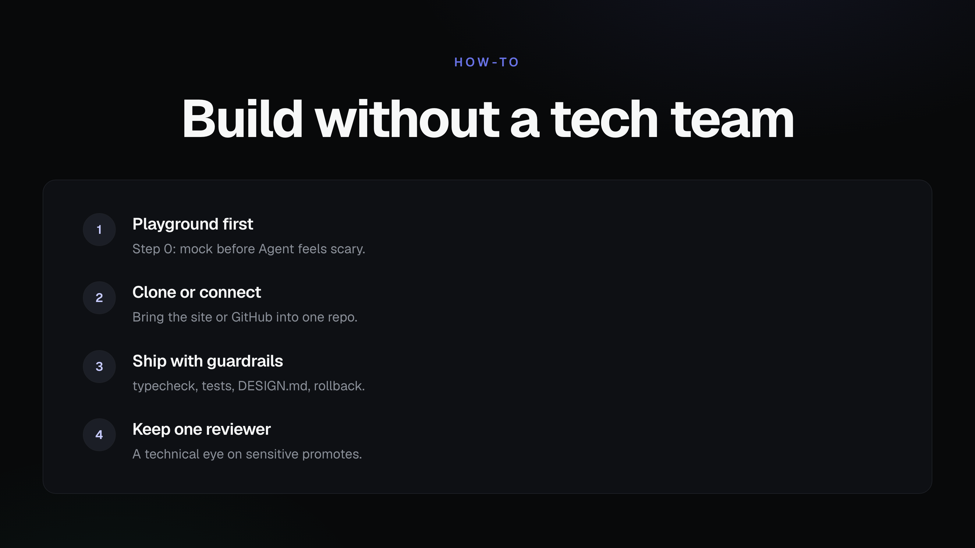
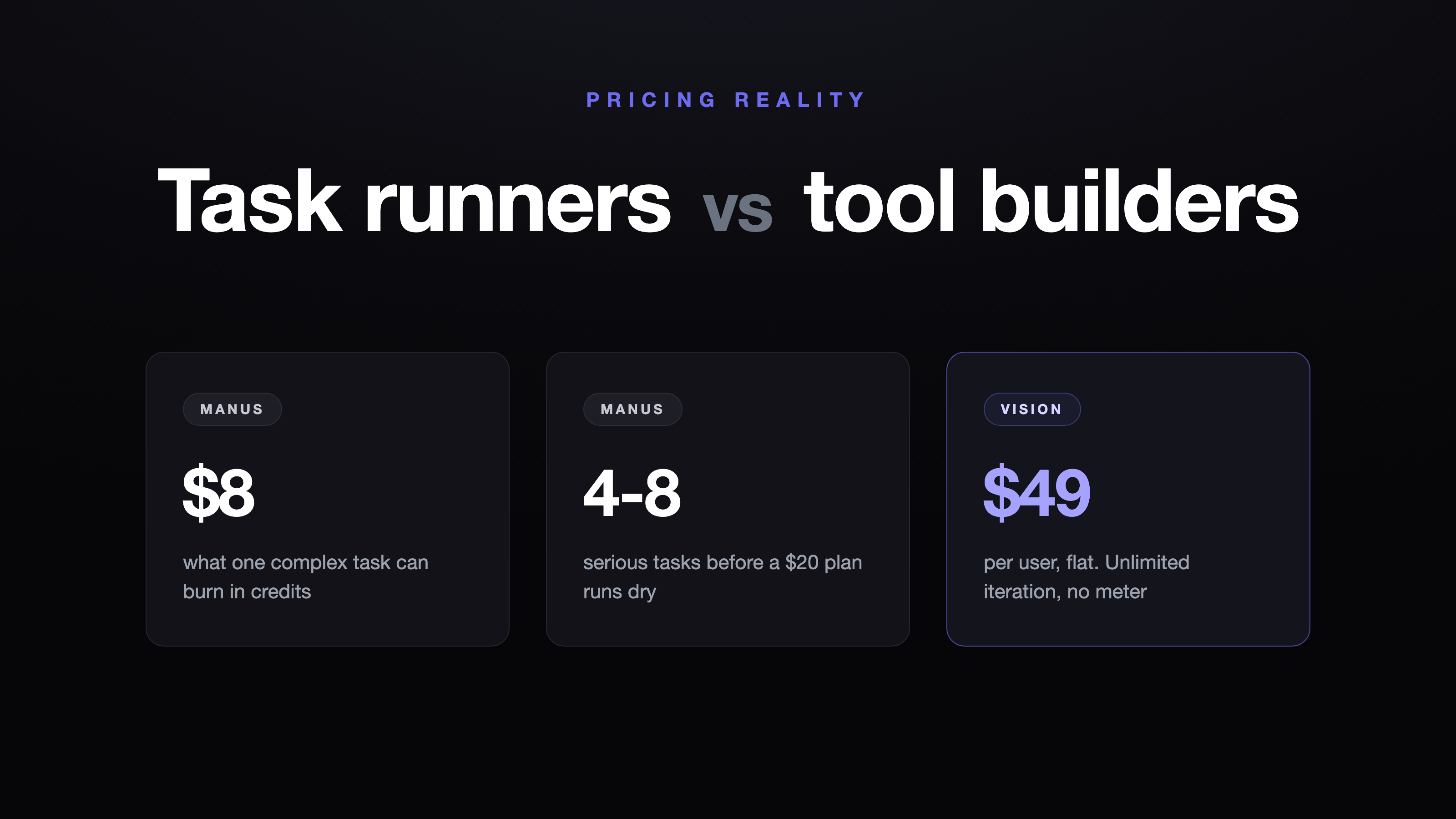
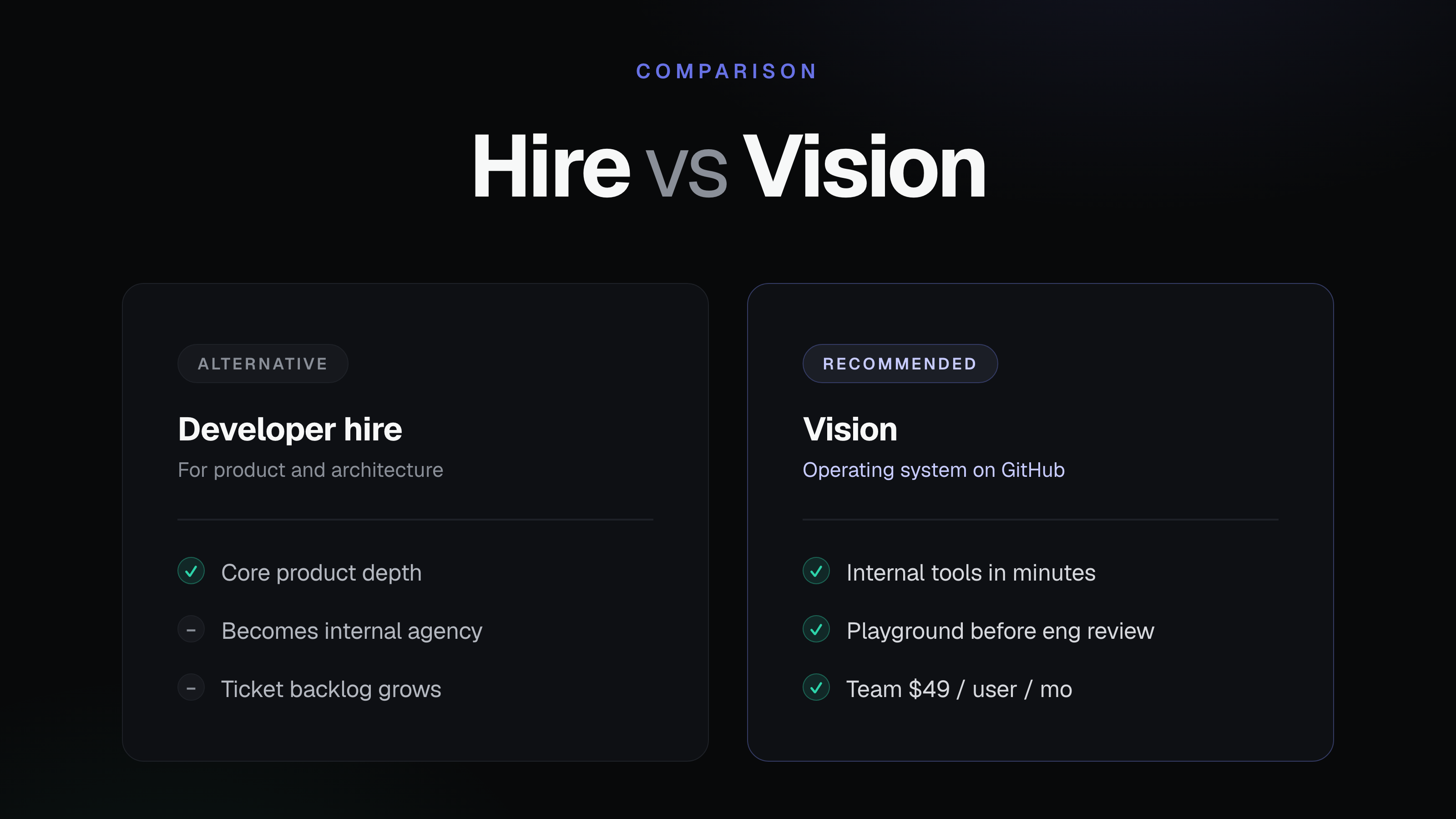
If you want a safer way to evolve software without forcing every change through an engineering backlog, Vision is worth a look. It helps teams build and update tools on top of existing codebases with live previews, reviewable code, controlled production promotion, and one-click rollback, so nontechnical teams can move faster while engineers keep oversight.
Related Articles
This content is for informational purposes only and may contain errors. Please contact us to verify important details.